HKBU 70th Anniversary Logo Design Competition Participated Work
HKBU 70:Academic Excellence Through Time
香港浸會大學七十周年:傳承智慧,引領未來
「參賽作品 (Competition Entry)」
By Ivan Chung


Design Concept :
This Design ingeniously integrates HKBU's logo with a unique "70" design element. The iconic book outlined from the logo serves as a framework, with "70" naturally incorporated within it, symbolizing both the seventieth anniversary milestone and HKBU's guest for knowledge. This minimalist design not only demonstrates HKBU's commitment to academic pursuit of excellence but also allow viewers to instantly understand and share the joy of HKBU's 70th anniversary.
標誌巧妙地將浸大校徽與獨特的「70」設計元素融為一體。校徽中標誌性的書本輪廓構成框架,「70」自然地融入其中,既象徵七十周年的里程碑,也代表知識之頁。這個簡約設計不僅展現了浸大對學術追求的純粹與卓越承諾,更以清晰的視覺語言,讓觀者能分享浸大70周年的喜悅。

「參賽作品 (Competition Entry)」
「參賽作品 (Competition Entry)」
「參賽作品 (Competition Entry)」
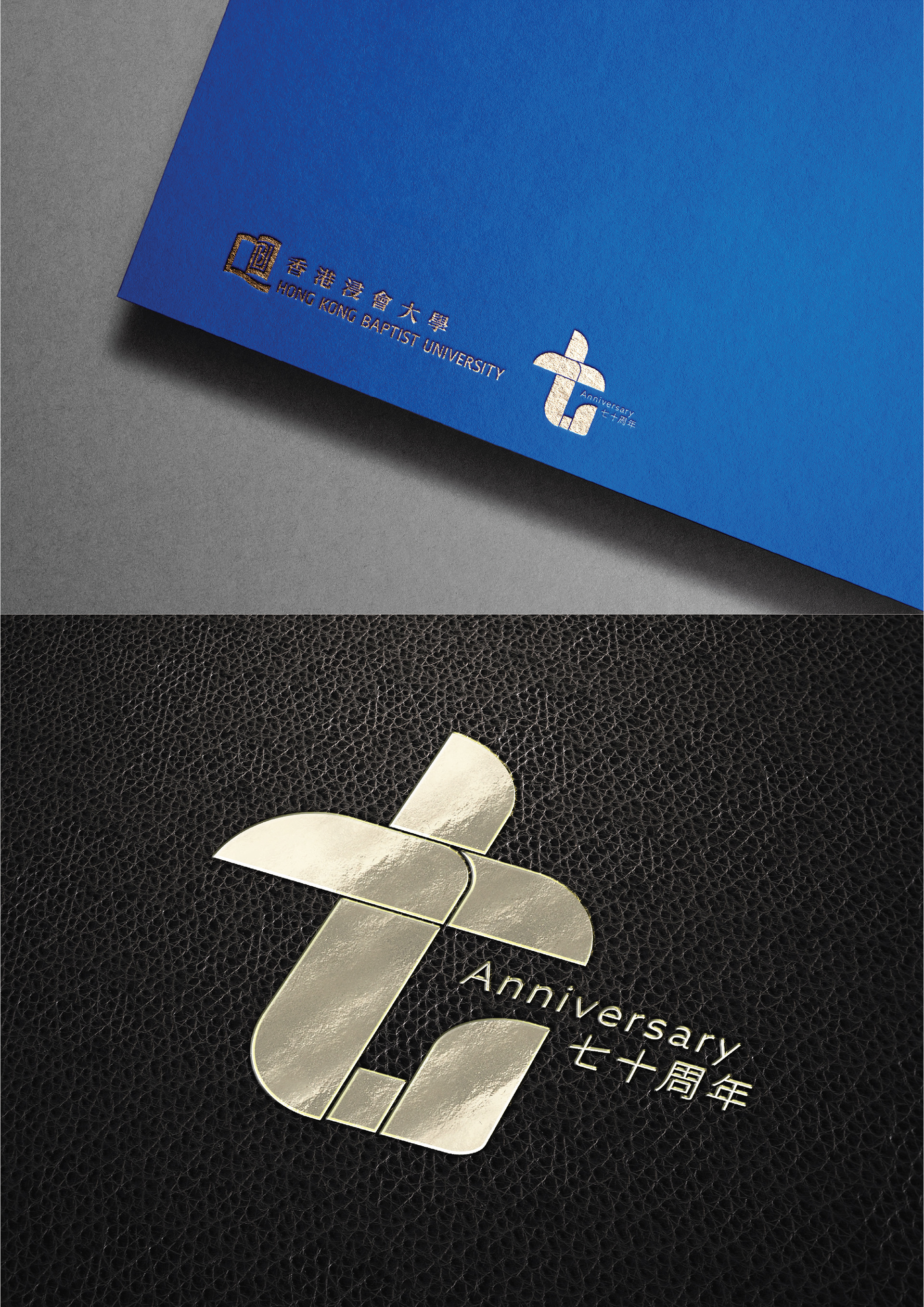
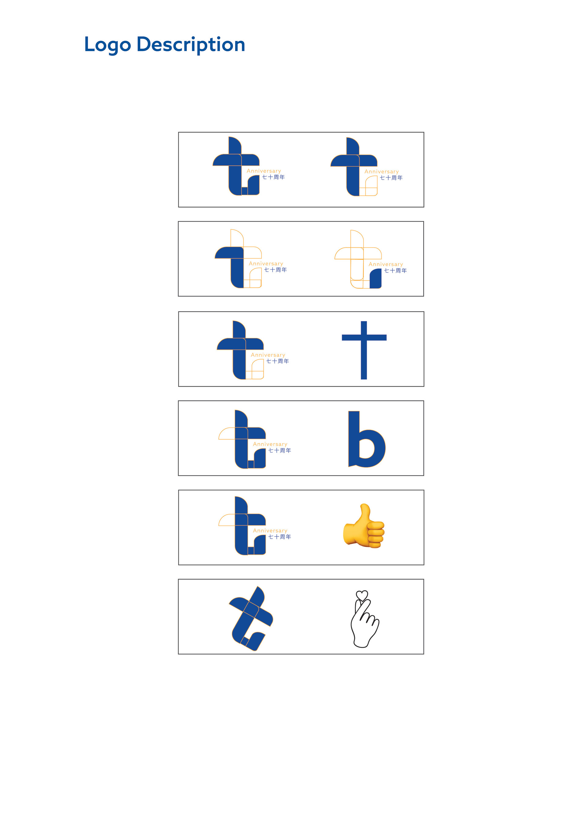
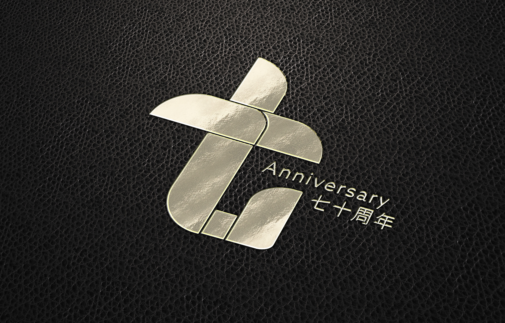
The logo adopts a minimalist design featuring the character
"seven" as its main element, with the left half incorporating christian cross to form "seventy," symbolizing HKBU's milestone of entering its seventh decade. The design contains multiple clever elements: the dark outline forms the number "70," while the right-side line naturally transforms into the letter "b," representing
"Baptist"; the central cross design not only represents "ten" but also symbolizes the Christian cross and suggests the convergence of multiple development directions. The overall composition is both modern and meaningful: it can be interpreted as a thumbs-up gesture, a popular heart gesture, or a blooming flower symbolizing growth. The dynamic flow of lines demonstrates progressive spirit; the harmonious and balanced composition embodies HKBU's new chapter of excellence in its 70th anniversary.
標誌以極簡主義設計呈現「七」字為主體,左半部結合十字,即七十,象徵浸大邁向第七個十年的重要里程碑。設計蘊含多重巧思:深色輪廓構成「70J數字,右側線條自然化為「b字母,代表浸大;中央十字造型不僅代表「十」,更象徵基督教十字架,同時暗示多重發展方向的交匯。整體構圖既現代簡約,又富有深意:可解讀為讚賞手勢,可視為流行的比心手勢,也可看作綻放的鮮花,象徵茁壯成長。線條走向充滿動感,展現進取精神;構圖和諧平衡,體現浸大七十周年邁向卓越的嶄新篇章。
「參賽作品 (Competition Entry)」
「參賽作品 (Competition Entry)」
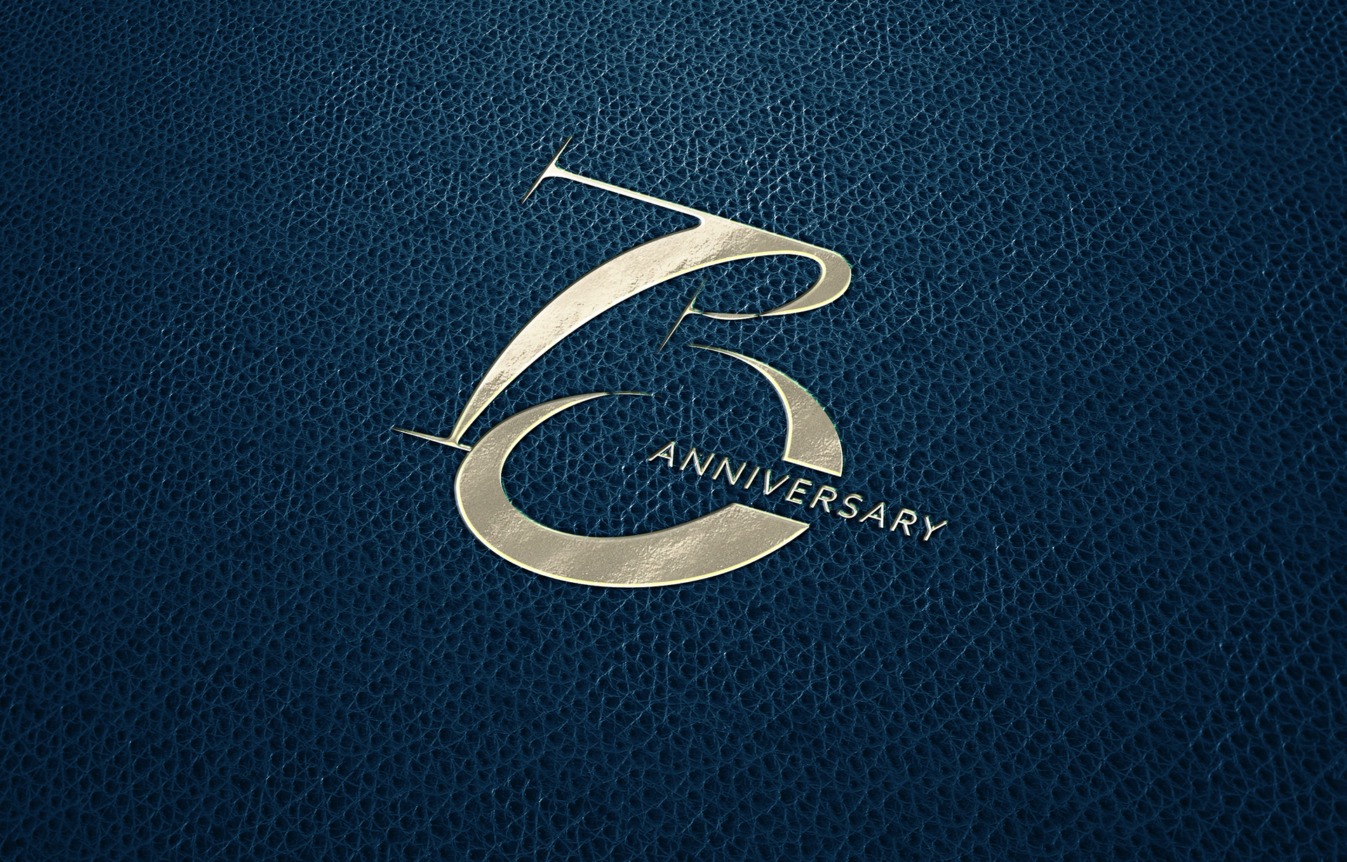
This logo design ingeniously integrates the 70th anniversary element with the university's acronym BU, marking HKBU's significant milestone towards a new era. Adopting a modern minimalist style, it allows viewers to instantly recognize both the number 70 and the letter B structure. The design cleverly transforms the lower half of the letter B into the number 0, which naturally extends into a letter U, forming the combined BU acronym, perfectly embodying HKBU's 70th anniversary unique visual identity.
本標誌設計巧妙地將70周年元素與校名縮寫
BU融為一體,標示浸大邁向新里程的重要時刻。
採用現代簡約風格,使觀者能即時識別標誌中的70字樣及B字母結構。設計上運用巧思,將B字母的下半部分轉化為數字0,再自然延伸成字母
U.形成BU的結合縮寫,完美體現浸大70周年的獨特視覺標識
「參賽作品 (Competition Entry)」
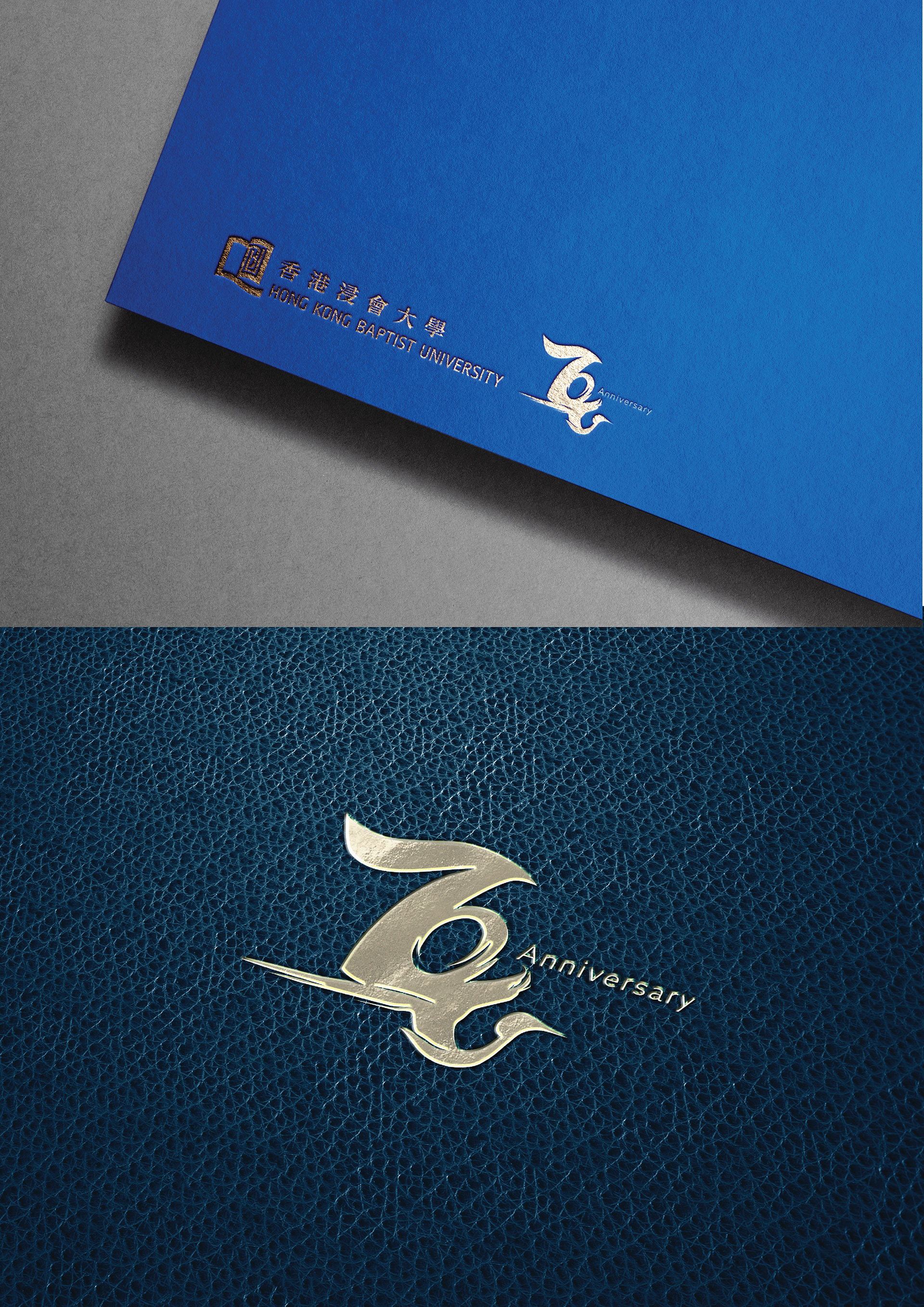
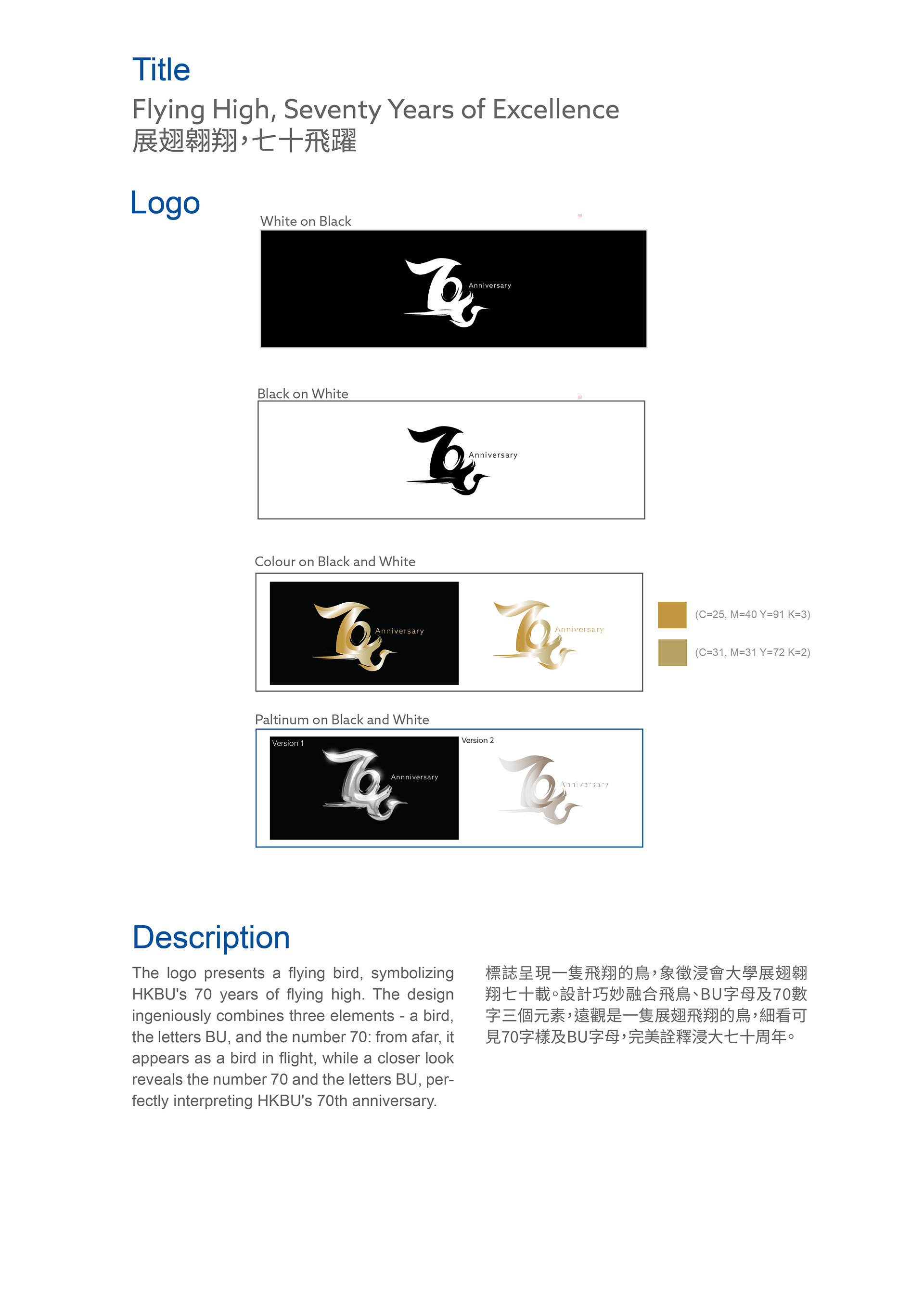
The logo presents a flying bird, symbolizing HKBU's 70 years of flying high. The design ingeniously combines three elements - a bird, the letters BU, and the number 70: from afar, it appears as a bird in flight, while a closer look reveals the number 70 and the letters BU, perfectly interpreting HKBU's 70th anniversary.
標誌呈現一隻飛翔的鳥,象徵浸會大學展翅翱翔七十載。設計巧妙融合飛鳥、BU字母及70數字三個元素,遠觀是一隻展翅飛翔的鳥,細看可見70字樣及BU字母,完美詮釋浸大七十周年。
「參賽作品 (Competition Entry)」
“Entry for HKBU 70th Anniversary Logo Design Competition (Unselected)”。